
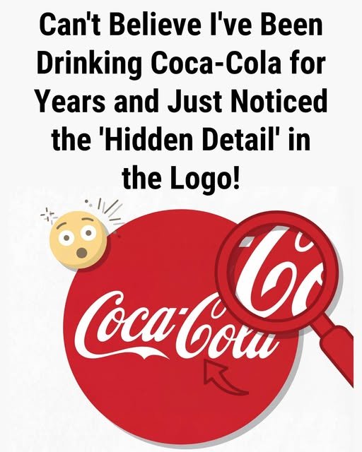
Sometimes a familiar logo can appear completely different once a small detail is noticed. Many people have pointed out that the second “C” in the Coca-Cola logo resembles a subtle smile. After seeing it, some viewers begin to associate the design with warmth and friendliness, even though the logo itself has remained unchanged for generations.
The Coca-Cola script was originally created in the 1880s by bookkeeper Frank Mason Robinson using the flowing Spencerian writing style popular during that period. Historical records suggest the design focused mainly on elegance, readability, and visual appeal rather than hidden symbolism or emotional messaging. Over time, however, people began interpreting certain shapes within the logo in more personal and imaginative ways.
This reaction highlights how human perception often works. People naturally recognize patterns, expressions, and familiar shapes in everyday objects and designs. After decades of advertising connected to celebration, happiness, and shared experiences, many viewers subconsciously connect those emotions with the logo itself. As a result, simple design elements may begin to feel more meaningful over time.
Well-known logos often develop a cultural identity beyond their original design purpose. While the artwork on paper remains the same, public perception evolves through memory, emotion, and experience. The continued fascination with small details inside famous logos reflects how strongly visual symbols can connect with people across different generations and cultures.
The Hidden Design Detail in the Coca-Cola Logo That Many People Are Noticing
For more than a century, the Coca-Cola Company has used one of the most recognizable logos in the world. Its flowing Spencerian script and bold red background have become deeply connected to global popular culture, appearing on everything from beverage packaging to vintage memorabilia. Despite its familiarity, social media users recently began sharing close-up images of the logo, pointing out a subtle design detail within the lettering that many people say they had never noticed before.
The attention online focuses on the negative space between the capital “C” and the first “o” in the logo. Some viewers believe the white space forms a small shape or figure depending on how it is viewed. Design specialists, however, often explain that shapes like these naturally occur in stylized handwriting rather than being intentionally hidden images. The original Coca-Cola script, created in the late 1800s, followed a flowing handwriting style that was common at the time, and this style naturally creates small pockets of space between connected letters.
What made the discovery spread widely online was the shared reaction from people who realized they had seen the logo many times without closely examining its details. Many readers admitted they usually focus on the overall design rather than the smaller visual elements created by curves and spacing. Once attention is drawn to these subtle shapes, however, they often become easier to notice each time the logo is viewed.
Whether the shape is intentional or simply a natural result of the lettering style, the renewed interest shows how powerful long-standing designs can be. More than 130 years after its introduction, the Coca-Cola logo continues to spark curiosity and discussion.
In today’s digital world, even a small design detail can capture widespread attention and remind people that familiar images may still hold interesting details worth noticing.